
Sound Design in Video: How It Shapes Pacing and Brand Perception
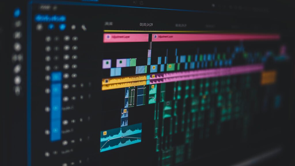
Mute any video on your website and watch what happens to the pacing. The visuals haven't changed, but the movement feels slower, flatter, cheaper. Sound design isn't a cosmetic layer—it is the invisible half of motion that dictates weight, cognitive cadence, and brand authority.
Mute any video on your website and watch what happens to the pacing. The visuals haven't changed, but the movement feels slower, flatter, cheaper. That gap is sound design, and most clients only notice it when it's missing.
When businesses commission a video, the conversation starts with visuals: color palettes, typography, illustration styles, and transitions frame by frame. Sound usually gets one throwaway line in the creative brief. Yet visuals only shape what viewers see, while sound shapes how they experience the movement.
Sound design isn't a cosmetic layer added at the end of post-production to fill the quiet. It is an inseparable dimension of visual pacing. It decides how movement feels, how transitions land, and how your brand is perceived. Precision pacing isn't only about speed—it's knowing when to hit and when to hold.
Sound Gives Motion Weight
Music sets the macro-pacing—the broad tempo and emotional key the story moves at. Sound design sets the physical weight of each micro-moment inside it.
The most common mistake amateur editors make is treating sound effects as a literal checklist: a whoosh for every slide-in, a pop for every bullet point, a generic bass drop for every scene change. Generic stock effects don't elevate a commercial video. They cheapen it, date it, and rapidly cause cognitive fatigue for the viewer.
Good sound design gives digital pixels physical mass. A subtle mechanical click makes a software button feel tactile and responsive. A low, restrained pitch riser gives a simple typography transition subconscious anticipation. Real-world textures—a key tap, paper sliding across a wooden desk, or the low ambient hum of an open studio space—ground motion graphics that would otherwise glide weightlessly across a synthetic void.
Audio Architecture Law #1: The Mass Principle
A sound doesn't need to replicate literal reality, and it rarely needs to be loud. It needs to support what the viewer sees and what the moment is meant to communicate. Often the quietest micro-transient is what makes an entire animation feel complete.
Case Study: The SaaS Interface Reveal
To see how audio shapes cognitive cadence, consider a real-world commercial breakdown:
The Brief
A fast-paced product explainer for a B2B SaaS platform. The film had to break down complex analytics dashboards, demonstrate rapid workflow velocity, and establish immediate enterprise credibility in under sixty seconds.
The timeline was cut against an upbeat royalty-free synth track with off-the-shelf sound packs. Every UI transition had a sharp swoosh, and every metric pop had a synthetic bell ping. On mute, the animations looked smooth; with audio, the mix felt frantic, crowded, and cheap.
We stripped 70% of the stock audio clutter. Music was ducked dynamically beneath the voiceover. Swooshes were replaced with subtle tactile clicks, low-friction glass glides, and muted organic taps. During key data reveals, music dropped out completely to let warm room tone breathe.
Negative Space: Silence Is Not Empty
The most common anxiety among junior editors is quiet. Afraid that a dip in visual or auditory stimulation will cause a viewer to swipe away, they fill every fraction of a second with driving beats, whooshes, and risers. But precision pacing is defined as much by what you pull away as by what you pack in.
Effective negative space rarely means absolute digital silence (0 dBfs zero output). Absolute silence feels unnatural—as though the viewer's wireless headphones suddenly lost connection. Cinematic silence is engineered on ambient presence: warm room tone, subtle air textures, low 40Hz sub-harmonic air, or the gentle hum of an open studio space.
The Contrast Engine
When you strip away the driving percussion and flashy sweep transitions—leaving only that quiet ambient air underneath the frame—you generate profound contrast. That breathing room is what allows a pivotal narrative line, an unexpected visual transition, or a crucial metric reveal to land with undeniable gravity.
Silence isn't the absence of sound. It is the disciplined absence of everything that doesn't earn its place in the mix.
Match Audio Density to the Message
The cognitive density of your script dictates how your sound design must behave:
- Information-Dense Product Demos: When presenting technical architecture, SaaS feature sets, or complex dashboards, the script is fast and the cognitive load is high. Aggressive synth melodies and heavy impact drops bury the narrator and force the brain to parse competing auditory signals. The audio must remain lean, crisp, and surgical, with subtle foley accents used strictly to punctuate key hierarchy shifts.
- Brand Manifestos & Emotional Films: An anthem or commercial spot operates on resonance rather than raw data throughput. Here, audio requires space to bloom: textures and low frequencies simmer under the narrator, gathering momentum until converging with visual keyframes at the climactic brand thesis.
Pacing is never about making everything uniformly rapid. It is about modulating velocity so the moments that matter actually have time to register.
Match Sound to Brand Persona and Audience
Sound design directly dictates perceived brand caliber. A meme account or viral satirical creator can rely on distorted, clipping bass boosters and exaggerated cartoon pops because the deliberate chaos is the joke. An enterprise SaaS company, a luxury hardware brand, or a high-ticket consultancy cannot.
Abrasive, mismatched, or cheap stock audio immediately undermines a brand positioning itself as calm, reliable, and premium—even if the underlying visual animation was rendered in 4K at 60fps.
The dividing line between amateur and commercial audio isn't whether you used expensive field recordings versus free libraries. It comes down to four fundamental craft decisions:
- Selection: Choosing materials that sonically match the visual texture on screen (e.g. frosted glass vs polished metal).
- Temporal Precision: Aligning acoustic transients with frame velocity curves (triggering transients 2 to 4 frames before optical cuts).
- Frequency Carving: EQ notch-filtering the sound effects so they never mask the fundamental frequencies of the human voice (200Hz - 4kHz).
- Restraint: Having the editorial maturity to leave 50% of animations completely un-sounded.
What to Listen For: Five Signs of High-Caliber Sound Design
Whether you are a founder reviewing an agency draft or a creative director reviewing a motion reel, watching on mute gives you only half the story. Put on headphones and evaluate these five benchmarks:
1. Restraint Over Clutter
Does every sound earn its place? If every single fade, chevron, and title wipe has a stock whoosh attached, the audio is wallpaper, not emphasis.
2. Physical Weight and Tangibility
Do on-screen elements feel grounded in the physical world? The timbre and decay of each sound should match the perceived material (matte plastic, glass HUD, heavy industrial steel), not sound like generic synthesizer white noise.
3. Transparent Auditory Hierarchy
Can you comprehend every word of the voiceover effortlessly without leaning in? Music and sound effects must live in the sidebands and low/high extremes, leaving the dialogue pocket untouched.
4. Ambient Continuity (No Digital Dropouts)
When the music pauses or the speaker takes a breath, does the audio drop into abrupt dead digital silence, or does it rest on an organic layer of room tone? Skilled sound designers never leave negative space completely empty.
5. Tonal Alignment with Brand Intent
Does the acoustic signature reinforce who you are? A calm, disciplined B2B infrastructure brand requires acoustic restraint; an adrenaline-fueled consumer sports brand demands explosive low-end impact. Sound must serve identity.
Frequently Asked Questions
How does sound design directly alter the perceived pacing of a video?
Auditory signals reach the human brain significantly faster than optical signals (~10 milliseconds for auditory stimulus versus ~50 milliseconds for visual stimulus). When a subtle transient or pre-roll riser hits slightly ahead of a visual cut, your nervous system anticipates the transition before your eyes finish processing the new frame. Different sound design choices can make identical visual timelines feel either hurried, weighted, sluggish, or relentlessly cinematic.
Can sound design make a video feel professional even if the visuals are minimal?
Yes. In fact, minimal aesthetics rely on audio even more heavily. Simple kinetic typography paired with precision spatial foley, subtle mechanical key clicks, and calibrated acoustic ducking creates an impression of severe polish and confidence. Conversely, Hollywood-grade 3D renders paired with cheap, clipping stock audio instantly feel like student work.
Should every single movement in a motion graphics video have an accompanying sound effect?
No. Over-sounded motion graphics produce cognitive fatigue. Sound should be reserved for primary focal shifts, metric confirmations, scene changes, and narrative punctuation. Leaving secondary and tertiary micro-animations un-sounded gives the primary elements their acoustic power.
Build Videos That Command Neurological Attention
Motion is more than what you see on a screen. It is the full multi-sensory experience that communicates credibility, weight, and commercial intent. If your brand needs commercial editorial and motion design calibrated down to the millisecond, let's build something unforgettable.